top of page

Click Log in or Sign up to leave a comment

It’s taken me some time to sit down and write this. I’ve been quiet, and I appreciate the patience and understanding of those who’ve noticed my absence. Today, I want to share the journey I’ve been on lately, both in my art and personal life.


Camille resting after painting, 1996.

As many of you know, my mentor and dear friend, Camille Przewodek, passed away recently. Camille was more than a mentor—she was a guiding light in my life and art. For over 25 years, we shared not only a studio but also a bond that went beyond teacher and student. She challenged, inspired, and ultimately, in many ways, shaped me into the artist I am today.


In May of this year, I had the privilege of spending four final days with Camille at the Plein Air Convention in Asheville, North Carolina. These were the last days of her relatively good health, and I cherish that time we had together. We painted together, and walked through the humid, damp landscapes as faculty field painters for the PACE attendees—soaking in the atmosphere of an area that has since sadly been impacted by Hurricane Helene. Reflecting on that now, I can’t help but think how close we were to what later became the center of that storm. Those days, though, were calm. There was something magical about them, a quiet understanding between us, though neither of us knew it would be the last time we’d share that space together. I felt honored then, and even more so now, to have had that time with her.


Camille Przewodek, 1996

Camille’s passing has been a profound loss for me. Grief is a complex emotion, and processing her absence has not been easy. After losing her, Al Tofanelli and I made the difficult move out of our shared studio space. In the earlier days, especially, our studio had been our sanctuary, a place where creativity flowed and where the boundaries between art and life often blurred. In the coming months, I hope to re-establish a new space of my own. It’s a bittersweet transition, but it’s a necessary one, a way to keep moving forward while holding Camille’s influence close to my heart.


There’s another chapter of my life tied to Camille that I’m ready to close: the house we shared in the south of France. It’s in the village of Soreze, which was once a place filled with memories—of quiet mornings painting under the French sun, deep conversations over wine, and inspiration drawn from the landscape surrounding it. I’m trying to sell the house, a decision that comes with its mix of emotions. As I step into this new phase, I ask for your good vibes and positive energy to help support the sale of our 400-500 year-old stone and mud house. It’s time for that chapter to close so that new ones can unfold.


Where we held classes and workshops.

In the time since Camille’s passing, I’ve found myself in a period of reflection. Creativity, for me, has always been a source of healing, but there are moments when the weight of grief makes it difficult to do creative work. I’ve taken this time to step back, to honor my feelings, and to allow myself the space to process everything. But I can feel the pull of the landscape tugging at me to be painted again, that quiet nudge that tells me it’s time to return. I know Camille would be lecturing me to get back to work, to not waste a moment and continue exploring the boundaries of light and color, and to carry forward the lessons she so dedicatedly shared with the art world.


As I emerge from this quiet period, I want to thank you all for your continued support. Your messages, thoughts, and kindness have meant more to me than I can express. The art community is a place of deep connection, and I feel fortunate to be part of such a caring network of friends and colleagues.


My things, (and Camille's things too), are safe in storage.


Moving forward, I’ll share more updates on my work and the exciting projects I’m working on. Camille’s influence will forever be woven into my art, and I hope to honor her legacy with each new work and creative project. There’s still so much more to discover, so much more to create, and I know she’ll be with me every step of the way.


Thank you for being here with me through this time of transition. I look forward to what’s next, both in life and in art.


Below is my tribute post to Camille from my Instagram page.


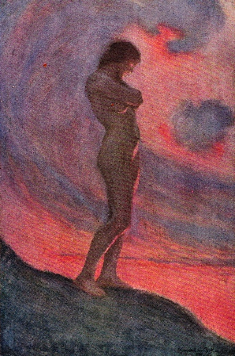
Some of Margaret C. Cook's powerful illustration plates for Walt Whitman's Leaves of Grass, 1913 edition.


(A section of my teaching is devoted to mood via color and tone. Below, are a selection of some stunning illustrations that are perfect examples of not just mood but stellar design.)

"The Sleepers are very beautiful as they lie unclothed. They flow hand in hand over the whole earth from East to West."


"How calm, how solemn it grows to ascend the atmosphere of lovers."

"Give me nights perfectly quiet... and I looking up at the stars."


"The night follows along, with millions of suns, and sleep, and restoring darkness."


"Thoughts, silent thoughts, of Time and Space and Death."


"The spy has that measureless pride which revolts from every lesson but it's own."


"They are calm, clear, well possess'd of themselves."


I painted this 6” x 8” demonstration piece in my late afternoon, seasonal weekly coastal class. It was an overcast day with a mixture of fog and clouds. When it was nearing 4 pm, the scene was lit with a magical ambient glow. I saw varying color shifts leaning toward red within the entire view (the light's quality in a scene’s entirety is what can be referred to as the “envelope of light”). I was attracted to the glimmer of light bouncing off the distant objects across the bay and the coolness, yet relative brightness, of the water in the distance. I saw an opportunity to use the natural shapes in the bay to move the viewer’s eye toward the glint of reflected lights off in the distance. I spent a few minutes deciding on my design with a quick sketch while noticing that I could further illustrate the cools shapes against the warm shapes in the same design.


Cloudy days commonly bring out cool lights and warm shadows. Nature gave me a perfect scene to demonstrate how the cools can play against the warms in such a pleasing way. I was careful not to have equal proportions of light to dark and warm to cool in my initial sketch. With a bit of “visual pruning” to the foreground bushes, I tried to create a composition that wasn’t 50-50.

 
“Light and dark, warm and cool color in equal proportions produce a static neutrality, balancing each other right out of the picture, one will destroy the other.”

- American painter Harvey Dunn (1884-1952)


I always try to paint related masses as one larger mass to simplify the composition to its basic parts. As in written language, a short statement delivers its intent much stronger than a long-winded sentence.


In my workshop, "Abstracting the Landscape," one of my main intents is to impart a little bit of wisdom that "less is indeed more." Paint related masses together as one large mass. It will simplify the composition and give more weight to the message you’re trying to deliver. Paint these big masses in first. Starting with the darks will show you right from the start whether you’re off to a strong design or if your painting is falling short.


So many times, we fall into the trap of placing too much emphasis on parts of our painting that are relatively unimportant to the whole – meaning it’s not where you want your viewer to be spending all of their time. Don’t spend too much time working on one area of your painting before getting spots of color down throughout your entire canvas. Your painting should start as deliberately abstract.


“You don’t emphasize the wrong word if you want to be understood. Neither should you emphasize the unimportant in painting.”

- Harvey Dunn


Many artists have proportioned their works to approximate the golden ratio or the golden rectangle. The longer side ratio to the shorter is the golden ratio—believing this proportion to be aesthetically pleasing. Using a Fibonacci caliper out in the field, we can quickly discern if our composition has pleasing proportions.


I did not design this composition with the golden ratio in mind. Still, I find it interesting that when superimposing the golden rectangle over my painting in multiple arrangements, I find many of the exact lines of the golden ratio match my compositional lines. I think the more we work at our art form, whichever that may be, our intuitive senses for pleasing shapes and good design become stronger. It would be an interesting experiment to superimpose the golden rectangle on several works over a period of years to determine if one's works were gradually falling into these beautiful patterns. Check out all of the combinations of the golden ratio that seem to work on this particular painting.

 
"In mathematics, he should go just as far as he can, for proportion is his means of expression. Ability to copy lines, shapes, tones, amounts to little. Ability to correlate lines, shapes, tones, is the rare necessary quality of the artist. ... "
"All good art is composition".

- Robert Henri

 
"I wish we didn't work so hard. We're too conscientious; we all act as though we're duty bound. There's no duty about art. Isn't Robert Henri's definition of art: 'a man's expression of the joy he takes in life?' Is there any duty about that? It should be an abundant overflowing."

- Harvey Dunn


The images above are from a demo done for my class at Depot Park in Sonoma.


The first painting was to work out a simple 3-value plan using three random colors. This plan was also designed to not only establish values but composition as well. When starting with your darkest note of color, you can quickly see if your composition is pleasing. In this stage, shapes can be easily seen and adjusted so that no shape is like any others. You can also see right away if you have a nice proportion of darks to light. As many of us know, it's all too common to create static 50/50 designs. I'm always striving to reach that one-third to a two-thirds ratio of lights to darks. I continually checked my value study in my color version to see if I was keeping honest with my design. Here, I tried to keep my values within a narrow range of the main 3 values I started with. It's a great exercise that I adapted from my early days painting with Peggi Kroll Roberts, and one I encourage my students to do regularly.


FREE Download! 15 PAGE Syllabus Introduction to my Teaching

FLIP BOOK PREVIEW - CLICK HERE TO VIEW


RECOMMENDED BOOKS FOR CONTINUAL STUDY

bottom of page